The awards this year came at my ditziest state! You know: that time of the year, usually weeks after your birthday, when the good feelings wear-off and you find yourself feeling fragile and older... Thanks to an award ceremony that recognizes, acknowledges and celebrates Anti-ageing creams, my mood was lifted immediately upon arrival (and suffice to say: the champers did it's part too - I tell no lies!)
I arrived 2 seconds before they announced the winners - which were:
Care Category:
Clinique Even Better Clinical Dark Spot Corrector & Clinique Repairwear Laser Focus and UV Damage Corrector.
Citations for the Care Category went to:
- La Prairie Cellular Radiance Concentrates Pure Gold Cream
(side note: if you live on a budget as I do, move fast when you see this brand - don't even embarrass yourself with trying the sample - the counter girls know what you're doing: POSING! If your skin has no budget, hop to it!)
- Decleor Aroma Night Beauty Cream - Regenerate
- Comfort Zone Range
Winner of the Make-up category:
Chanel Rouge Coco Lipstick in 05 Madamoiselle
Citations for the Mae-up Category went to:
Elizabeth Arden Pure Finish Mineral Tinted Moisturizer SPF-15
Sensai Bronzing Gel SPF 6
Maybelline Superstay 24H Makeup Micro-FLex Stretch Formula SPF 19
Local Hero Award went to:
Optiphi Range. They are a hi-tech cosmoceutical range to treat and delay the signs of ageing as well as sun damage -- see why I love local? they speak Maquenese! forget Pretoxing, Optiphi!! (ahem, Optiphi! should you ever need a copywriter... or someone to look cute at your offices while raiding your storage... my email addy is on footer of this page)
Socially, Marie Claire knows how to invite them! These were some of the DeGorgeous guests at the Radisson Blu (Sandton Eye) Hotel Lobby, where the event took place:Terry Pheto (please note the latest Thula frock on her) and Thula Sindi (who gave me a snippet about his new project - watch this space! April is the month, he said).Uyanda, Head Visual Merchandiser at Edgars Melrose Arch (one of their flagship stores), in a DeGorge Thula Sindi Jacket from his latest fall collection.Designers: Thula Sindi with Abigail Betz Savannah Walley (who manages Sandton City's social media platforms) having a chat with Sonia Booth (who is busy on a very exciting project, more on that later)Tatum Keshwar - don't you just love her new bangs?Sharon Becker (Fashion Director of Marie Claire, yup, this is our Nina Garcia and she is too fab for words), with Felipe Mazibuko who had a LMAO moment with Tamara Dey (who you obviously can't see in this pic).Miss Milli B (fashion blogger/entrepreneur) with Chris, Jenny Andrews (with a new fabu-bubu new hair cut) and Dion ChangKuli Roberts and Lucilla Booysen - long time gal-pals apparently. (then again, Kuli used to run the South African version of Fashion Police - not the current set-up but one similar to the version Robert Verdi used to host before Guga'Thandayo, Joan Rivers, took over - which explains the thread between them - not that a thread is necessary).Jen Su in a David Tlale sequin numberJane Raphaely (CEO of Associated Magazines which she runs with her daughters), being interviewed by Kuli Roberts (I should've eavesdropped on this one, her questions are always gobsmacking)Forgive me for I do not know his name (yes, that meant to sound like a cubicle conversation with the pretre), but we somehow land up at the same events (must make a point of saying hello!). This man, in my opnion, is one of thee best dressed men in South Africa. His clothes show such love and detail for fashion - just the slippers he wore alone made my day!Aspasia Karras - editor of Marie Claire South Africa.Tamara Dey enteratined us and closed with Brenda Fassie song, Promises - which she sings with so much soul! make a point of requesting that one if you book her for an event.
awesome Goodie Bag, Thank you Marie Claire (via their super-sweet Publicist, Jaco-Louis Groenewald) AND Edgars!
PS> thank you Aspasia, lol - I know you know why I laughed at that.
Saturday, March 12, 2011
Wednesday, March 2, 2011
Customizing the Perfect Little Black Dress
This is technology at it's very best if you ask me:
The idea behind it all is that one can design the perfect LBD online, get it manufactured and shipped to your doorstep - this is the the brainchild of L.A.-based designer, Mary Huang. This would be the perfect LBD because it is customized to perfection using your body-type and preferences. So think Gaga, think Avant Garde, think ready to wear, think red carpet... now you can make it happen!
The technology behind is:
There is a web-service application, by Continuum, which one can use online to design their ideal "it" dress and view it in 3-D. Upon your approval, this dress can get made for you and delivered.
The nitty-gritty in the technology is that the application is based on Deluanay triangulation, which is jargon for a dress designed, cut and assembled out of triangles. The drawing assistant tools on the site make it easy to "design" a garment at the blink of an eye - so one does not need the technical skills to draw... just your imagination is enough.
Here's how it all works:
Currently, as technology does not "drape" and conform to reality as well as working with real-life fabric does, the overall aesthetics (ignoring design) will be very similar: cone-shaped LBDs with protrusions all around it or simple LBD made out of triangle cut-outs - but this simple start is ready to flood how Technology meets fashion.
you can also go give designing a bash here - enjoy playing around, I did!
Images and clip found here
The idea behind it all is that one can design the perfect LBD online, get it manufactured and shipped to your doorstep - this is the the brainchild of L.A.-based designer, Mary Huang. This would be the perfect LBD because it is customized to perfection using your body-type and preferences. So think Gaga, think Avant Garde, think ready to wear, think red carpet... now you can make it happen!
The technology behind is:
There is a web-service application, by Continuum, which one can use online to design their ideal "it" dress and view it in 3-D. Upon your approval, this dress can get made for you and delivered.
The nitty-gritty in the technology is that the application is based on Deluanay triangulation, which is jargon for a dress designed, cut and assembled out of triangles. The drawing assistant tools on the site make it easy to "design" a garment at the blink of an eye - so one does not need the technical skills to draw... just your imagination is enough.
Here's how it all works:
Continuum Ddress UI from Mary Huang on Vimeo.
Currently, as technology does not "drape" and conform to reality as well as working with real-life fabric does, the overall aesthetics (ignoring design) will be very similar: cone-shaped LBDs with protrusions all around it or simple LBD made out of triangle cut-outs - but this simple start is ready to flood how Technology meets fashion.
you can also go give designing a bash here - enjoy playing around, I did!
Images and clip found here
Saturday, February 26, 2011
David Tlale Fall 2011
sub-heading: To whom much is given, much is expected.
After a flood of earned and self-generated media campaign of David showing his fall collection at the bridge, I got nervous - but he's David, he always delivers...
When I arrived at the pre-drinks session to be met by half of Johannesburg outside David's studio, I got nervous - but he's David, he always delivers...
When hordes of people were turned away from entering from the closest entrance to David's Studio, where the pre-social happened, twitter started firing up with annoyance, I got nervous - but he's David, he always delivers...
When I found myself on the bridge frantically looking for a seat - and being told that the demarcated media area was in shambles (due to unforeseen circumstances), but the ever-willing publicists found me a perfect spot - but when I saw the multitudes where still shuffling around to find even a curb to sit their behinds down, 5 minutes prior to the scheduled late show, I got nervous - but he's David, he always delivered...
2 hours post the scheduled time, I switched to twitter to find thee most accomplished of people in the fashion circles annoyed, I got nervous - but he's David, he always delivers.
Did he deliver?
The sombre music opened the floor while ramps marched down the ramp in dark floor-length capes and headed to the middle of the Bridge to a raised platform which played backstage for the duration of the show - clever trick there.
The colour palette David had for his fall collection is typical of winter: blacks, greys and whites while the solid, deep red splashed across all the garments gave the fall collection a femme fatale, luxurious finish which was an incredible thread throughout the collection.
Other than volume in uninspiring locations (cuff, upper arm and hips), the basic silhouette was reminiscent of all David's shows (including his NYFW 2009 ollection) in the past - a trait they also adopted in their Africa Fashion Week's "Butterfly collection" - which left the choice in fabric and intricate detailing to deliver fresh ideas to tried-and-tested fantastic templates.
The cottons, silks and satin (with retro-inspired) patterns DID DELIVER. His referencing of his old collection and retro-inspired prints merged together to capture the old-world, new-charm aesthetic which is where South African street-style sits at the moment.
It was one of the few shows which David did not overstyle which simplifies it for the consumer. It was less intimidating which then found more people relating to some of the pieces in the collection (which could translate to breaking the ice between potential-consumers and the brand)
An overall good collection, bar by the many fillers which, in my opinion, are fantastic collection spin-offs but should not have been in the collection itself but with an ambitious 92-piece collection to pull-off, thoughts of this were not entertained, which is a real pity. eg, though all very different, the 10-odd wet-look voluminous dresses and white shirts (each with it's own uniqueness in terms of design) seeing all 10 (though, again in my opinion) were not the core collection.
With all this said, I just really need to ask (and I am guilty of blushing and gushing in excitement when the presentation of the collection requires "out of the box"-thinking): was the SHOW bigger than the COLLECTION? or the perfect marriage? I would really like to see a more subdued show and more drama in the collection...
TO answer: David delivered, but forgot to edit, he misaligned his collection with the drama that his media-mentions generated but the collection was thorough, complete, beautiful and solid - which, when all is said and done, is what its all about, THE CLOTHES!
Pics by Simon Deiner
Thursday, February 24, 2011
Heni
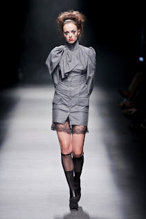
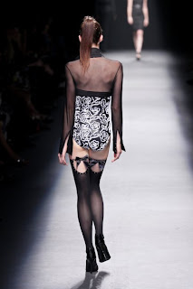
The entire collection was made up of 4 basic colours: Red, gray, Black and white - who can say no to that for winter... the 2 (or rather 4) are synonymous!
The tale told by the collection was about the agony of growing up, the transition from girl to woman and the bondage that that stage of life can have on any woman. With that said, the collection could've turned very "matrony" but instead turned into a sexy, strong collection.
I did find some of the fittings awkward (looked like the slits were about to split) due to the tailoring - whether by design or execution, it was a a bit strange... I thought i might even see someone's "good china crockery" on the catwalk. Other than questionable tailoring, the collection could appeal to aby age group as it had elements which showed pure maturity (and very boardroom-ready) while some lace-finished garments had a grunge feel which could easily appeal to a dark-humoured 16 year old. BUT all very feminine - yes it was quite a spectacle to move from one look to the other which reiterated the narration.
But the colour palette was strong, the red tape was used effectively (something I might even consider doing myself) and the clothes were nicely snug (the return of the body con?) and flattered the body.
Loved the sheer material and the pussybow-fastened Capes. Loved the padding on some dresses as it gave a fuller figured female silhouette and that too showed hints of the winter 50s trend! Loved the overall styling including the strange, bloodthirsty-person-looking make-up.
The tomboyish appeal also tapped into my love of androgyny which I revel in upon seeing it.
PS ain that David in the black hosiery? yes, the make-up artist?
Pics by Simon Deiner
Tart
While playing with the idea of contrasting women behaviour - hard and soft -, Cari (the Tart designer) nailed one piece I would've loved to see more of: the DeGorge leather collars.
These collars offer wardrobe versaility, shifting a basic tank from gym-look to urban chic, which is an excellent look at the need for designer's vision to be easily incorporated into the consumer's lifestyle.
I loved that the collar could also be accessorized to give it longevity (as one look can get a little tired) while maintaining a good chic, street cred.
Congratulations on your 10 years! An awesome achievement and I loved the groupie prints...
The collection, overall, was flooded with standard staples but the collar was a winner for me!
Pics by Simon Deiner
Abigail Keats
Wearable, functional, beautiful, lady-like, staples - that's all you need to know.
But please, I insist, have a look at the skinny extra-long belt... noticed the coil? Detail! Now practice, I am (can't seem to crack it but i will persevere)
Pics by Simon Deiner
Monday, February 21, 2011
Thula Sindi
To truly appreciate this collection, one has to follow the story and how it built up to this climax (which I have): this was "Woman of Consequences: part 3, the finale."
Thula's last three collections, including this one, are threaded by his desire to see women well dressed, suggestively sexy, confident and playful - "Woman of Consequences" knows how to handle all that comes her way and it was with this tale and how it build up towards this design crescendo that interested me.
In this collection, which is a natural follow-up of his previous collection, the "woman of consequences" dares to be a little more sexy and vicious, all well controlled, which is depicted by the vivid colour use.
The pieces that stuck out most for me where the voluminous skirts which are 10 metres when fully spread out - no tulle used here - which give the covetable '50s silhouette while remaining faithful to Thula's impeccable choice in fabric.
The rich colour choices saw me yearning for winter too.
Thula's overall aesthetic has changed, with notable changes in the silhouettes which have changed from shift dresses to volume, separates (which are much more versatile in a wardrobe) and peaked shoulders
With that said, I was not particularly fond of the styling, for instance, I found some of the belt-cinched jackets a little awkward and could've done without the belt while the bling-tricks (which followed-up from Woman of consequences part one, ie fall 2010) brooches where well received for the story, but did not exactly tie in well with this particular collection - or is that a matter of preference?
Overall... this "woman of consequence" is drastic, dramatic while remaining conservative - and I truly enjoy seeing her story unravel... like peeling an onion, there is more to unpack with her.
Pics by Simon Deiner
Subscribe to:
Posts (Atom)